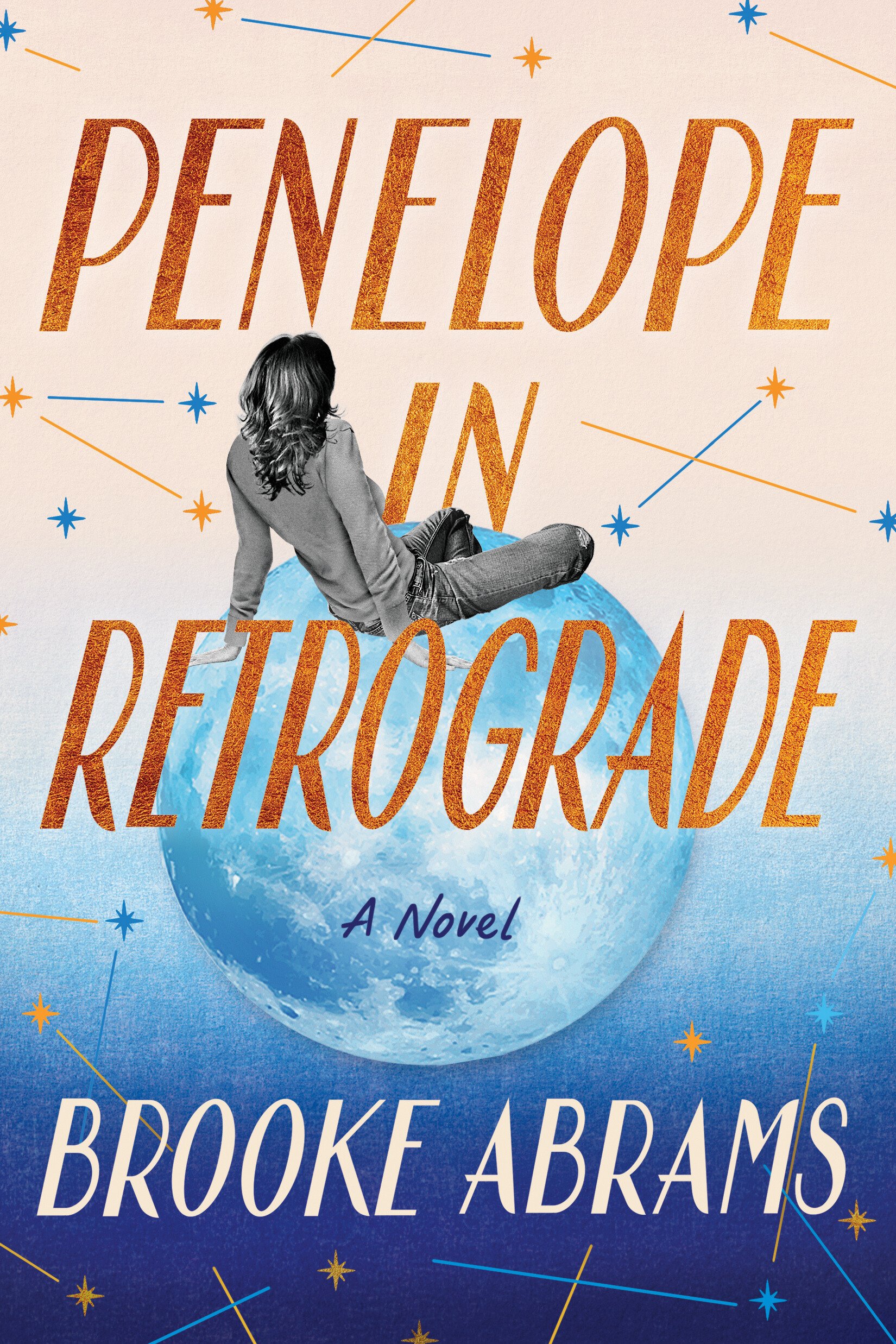
cover reveal
A book cover is an invitation.
It’s the opening of the door of an author’s imagination, heart and soul.
It’s the welcome mat that lets readers know that they are about to enter a space they want to be in, and hopefully, it’s a space they will revisit again and again.
An author has minimal control when it comes to the cover of their book. When I was asked for my input about Penelope’s cover, I had two major requests: Penny needed to be on the cover, and so did the moon. I provided a few samples of covers I really love, and I gave some notes about elements in covers that don’t appeal to me. That was it. Everything else was up for interpretation, which feels a little crazy. I’ve read Penelope in Retrograde a bazillion times. I’ve painstakingly OK’d every edit and change, right down to each comma. At this point, I know the Banks family just as well as I know my own. Having someone else create the cover felt a bit like being blindfolded in a hair salon and telling the stylist to do whatever they want. Things could go south really quick, and much like bangs, there’s little an author can do to change their cover if it’s not what they were hoping for.
Side note: I’ve been growing out my bangs again, and why at 37 years of age do I still not know better than to get bangs.
I digress.
Thankfully, the artist for my cover is a brilliant, genius. He gave me Penny. He gave me the moon. He gave me everything I wanted, and all the things I didn’t know I needed. A beautiful color palette, and a surreal concept that makes me smile every time I look at it.
In a nutshell, it’s the undisputed best book cover anyone has ever made me.
Are you ready for it? <cues Taylor Swift>
.
.
.
.
.
.
.
.
She’s here!
Cover Design by Phillip Pascuzzo
Cover image: Mike Harrington/ Getty; Dimitris66/ Getty; 4x6/ Getty
I’m so thankful to the cover team at Lake Union Publishing and Amazon!
